import pandas as pd
from ucimlrepo import fetch_ucirepo
from sklearn.model_selection import train_test_split
from tabicl import TabICLRegressor

wine = fetch_ucirepo(id=186)
X = wine.data.features
y = wine.data.targets["quality"]

X_train, X_test, y_train, y_test = train_test_split(
    X, y, test_size=0.25, random_state=1
)

reg = TabICLRegressor(random_state=1)
reg.fit(X_train, y_train);8 Quantile regression
Tabular foundation models predict entire distributions, not just single values. That makes it possible to quantify uncertainty with prediction intervals instead of point estimates.
In Chapter 7, we explored mean regression and took our first peek at predicting the median. TabICL, however, is capable of predicting arbitrary quantiles.
That’s what we are going to do in this chapter.
Definition: Quantile
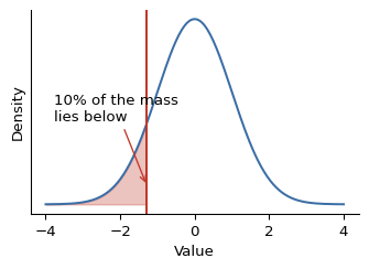
A 10% quantile of a predictive distribution is the value below which the model places 10% of its probability mass for the ground truth, and 90% above.
Predicting quantiles with TabICL
We re-use the wine quality dataset from Chapter 7 and predict quantiles.
The first part of the code is the same as in the regression chapter:
So far, so good. To make the model produce quantiles instead of predicting the mean, we only have to change output_type in the predict function to quantiles, and pick the quantiles we want:
alphas = [0.1, 0.5, 0.9] # the quantile levels we want
y_pred_q = reg.predict(X_test, output_type="quantiles", alphas=alphas)
print(pd.DataFrame(
    y_pred_q[:5], columns=[f"q={a}" for a in alphas]
).round(1).to_markdown())| q=0.1 | q=0.5 | q=0.9 | |
|---|---|---|---|
| 0 | 5 | 5 | 6 |
| 1 | 5 | 5 | 5 |
| 2 | 4.7 | 5 | 6.4 |
| 3 | 4.8 | 6 | 6.3 |
| 4 | 4.9 | 5 | 5.7 |
This gives us the predictions for the 10%, the 50% (the median), and the 90% quantiles for each test data point.
For regression, TabICL is pretrained to predict quantiles. 999 quantiles, to be exact. Due to the different scale of the targets, and the need for a different head in the architecture, regression pretraining is distinct from classification pretraining.
Visualizing the prediction band
Quantiles allow us to quantify the uncertainty of predictions. While the 50% quantile prediction gives us a great point estimate, we can create a prediction band from the 10% and 90% quantiles.
The wine data has no temporal structure, but we can still visualize a prediction interval for each wine. For Figure 8.1, I sorted the test wines by their median quality and plotted the median plus the prediction band from the 10% to the 90% quantile.
import numpy as np
import matplotlib.pyplot as plt

order = np.argsort(y_pred_q[:, 1])
sample = order[np.linspace(0, len(order) - 1, 20).astype(int)]
q_low, q_med, q_hi = y_pred_q[sample].T
rank = np.arange(len(sample))

fig, ax = plt.subplots(figsize=(6, 8))
ax.hlines(rank, q_low, q_hi, color="lightgrey", lw=3, label="10th–90th percentile")
ax.scatter(q_med, rank, color="darkgrey", s=15, label="median prediction", zorder=3)
ax.scatter(y_test.iloc[sample].values, rank, color="#c0392b", s=25, marker="x", label="actual", zorder=4)
ax.set(ylabel="Test wines (sorted by predicted median)", xlabel="Wine quality")
ax.set_yticks(rank)
ax.invert_yaxis()
ax.spines[["top", "right"]].set_visible(False)
ax.legend(loc="lower center", bbox_to_anchor=(0.5, 1.01), ncol=3,
          frameon=False, handletextpad=0.4, columnspacing=1.8)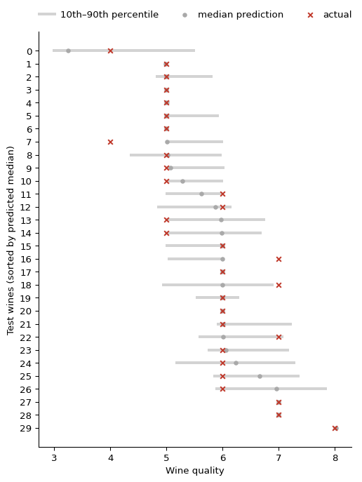
We can see how the predicted median rises from the low- to the high-quality wines, with each wine getting its own prediction interval. Since wine quality is an integer score, the actual values land on discrete levels, but they mostly fall within the 10%–90% interval. The interval width varies from wine to wine, reflecting how confident the model is about each individual prediction.
Evaluating with pinball loss and coverage
Let’s evaluate the predictions. Per wine, there are 3 predictions to evaluate, and we have multiple options for how we evaluate those. With the pinball loss, we can evaluate each quantile prediction on its own (but of course aggregated across the test data).
from sklearn.metrics import mean_pinball_loss

print(pd.Series(
    {f"pinball@{a:.1f}": mean_pinball_loss(y_test, y_pred_q[:, i], alpha=a)
     for i, a in enumerate(alphas)}
).round(2).to_frame(name="loss").to_markdown())| loss | |
|---|---|
| pinball@0.1 | 0.08 |
| pinball@0.5 | 0.18 |
| pinball@0.9 | 0.09 |
What we see here is typical: the median loss is larger than the pinball loss for the tails. The 10% and 90% quantiles have a similar loss, so the model does an equally good job for both.
Since we used the 10% and 90% quantiles to create prediction bands, a natural question to ask would be: how often does this 80%-band actually cover the true quality? Ideally, the answer should be 80%. This is also called calibration: how well the model outputs are calibrated to the actual probability distributions.
in_band = (y_test.values >= y_pred_q[:, 0]) & (y_test.values <= y_pred_q[:, 2])
print(f"Empirical coverage: {in_band.mean():.1%}")
Empirical coverage: 83.1%The empirical coverage is close to the nominal 80%, and even slightly above it. Prediction bands produced via quantile regression often suffer from undercoverage, but here the band is well-calibrated, if anything erring slightly on the wide side. Tabular foundation models typically do very well in this regard. The ScoringBench benchmark (Landsgesell, Knoll, and Wenzel 2026) evaluates TFMs against traditional models with proper scoring rules across 97 regression tasks, and TFMs produce typically rather well-calibrated probabilistic predictions.
Predicting the full distribution
In the beginning, I said that TabICL predicts basically any quantile, as it is pretrained to predict 999 quantiles. In fact, when you pick output_type="mean", then TabICL predicts all quantiles in the background and uses those results to derive the mean estimate.
Considering that you essentially get 999 quantiles, you have more information than you need to construct the entire predictive distribution. It’s just a matter of picking a grid of quantile levels (alphas).
Extra quantiles are free
Calling predict with multiple quantile levels is as fast as a call with a single quantile level or the mean.
import numpy as np

alphas_dense = np.round(np.linspace(0.025, 0.975, 20), 3).tolist()
y_pred_dense = reg.predict(X_test, output_type="quantiles", alphas=alphas_dense)
I’m curious to explore an extreme case: let’s have a look at the wine with the highest alcohol level in the test set. Alcohol content is one of the strongest predictors of wine quality, with higher alcohol typically going hand in hand with better wines, so I’d expect a high quality score.
idx = int(X_test["alcohol"].argmax())
X_test.iloc[idx]
fixed_acidity 6.40000
volatile_acidity 0.35000
citric_acid 0.28000
residual_sugar 1.60000
chlorides 0.03700
free_sulfur_dioxide 31.00000
total_sulfur_dioxide 113.00000
density 0.98779
pH 3.12000
sulphates 0.40000
alcohol 14.20000
Name: 5517, dtype: float64This wine has an alcohol content of 14.2%, about as high as it gets in this dataset, so it should score well.
Let’s construct the predicted distribution from the 20 quantiles that TabICL predicted.
q = y_pred_dense[idx]
widths = np.diff(q)
mask = widths > 0
heights = np.diff(alphas_dense)[mask] / widths[mask]

fig, ax = plt.subplots(figsize=(7, 4))
ax.bar(q[:-1][mask], heights, width=widths[mask], align="edge",
       color="#3b6ea5", alpha=0.7, edgecolor="white")
ax.axvline(y_test.iloc[idx], color="#c0392b", lw=2, linestyle="--", label="actual")
ax.set(xlabel="Wine quality", ylabel="Density")
ax.legend(frameon=False)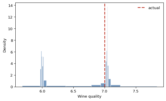
We see a predicted distribution sitting at the high end of the quality scale, with most of its mass concentrated around 6 and 7. The actual quality of 7 falls right within the bulk of the distribution: the model correctly anticipated a high-quality wine. Since the Wine Quality data can only take on integers, we also see that predictions cluster around integers as well. First note here: It’s great that TabICL picked it up, that’s something a linear regression model could not do. But my second thought here is: Maybe we should not treat it as a regression, but as a classification problem.
I did try that: refitting the problem as 7-class classification and comparing it against regression on both regression and classification metrics. The results were a mixed bag, no clean winner, which of course raises more questions than it answers. Going deeper here would take us too far into the weeds for this chapter, but it’s a reminder to stay creative about task design.