import random, numpy as np
import pandas as pd
from ucimlrepo import fetch_ucirepo
random.seed(42)
np.random.seed(42)

df = fetch_ucirepo(id=275).data.original
df["timestamp"] = (
    pd.to_datetime(df["dteday"]) + pd.to_timedelta(df["hr"], unit="h")
)9 Time series forecasting
Time series forecasting can be reframed as a regression problem. Tabular foundation models can then forecast without any forecasting-specific architecture.
Next up, we are going to look at time series forecasting. While there are dedicated time series foundation models, we’ll use a wrapped version of the TabICL regressor. The underlying trick is reformulating forecasting as regression (Hoo et al. 2025). But first, let’s talk about the data.
The Bike Sharing data
We use the Bike Sharing dataset (Fanaee-T and Gama 2013) from the UCI Machine Learning Repository. The data contains hourly rental counts from the Capital Bikeshare system in Washington, D.C., between 2011 and 2012, together with weather and calendar information. Bike rentals are split into casual and registered users, which sum up to the total count cnt, and which is the target we start with.
Let’s load the data.
For simplicity, we predict the total rental count (cnt) without any features besides the timestamp. For that, we pull out just the timestamp and target from the data.
series = df[["timestamp", "cnt"]].rename(columns={"cnt": "target"})
print(series.head().round(1).to_markdown())| timestamp | target | |
|---|---|---|
| 0 | 2011-01-01 00:00:00 | 16 |
| 1 | 2011-01-01 01:00:00 | 40 |
| 2 | 2011-01-01 02:00:00 | 32 |
| 3 | 2011-01-01 03:00:00 | 13 |
| 4 | 2011-01-01 04:00:00 | 1 |
This is what the first full week from Monday to Sunday looks like:
import matplotlib.pyplot as plt

window = series.iloc[48:(48 + 24 * 7)]
fig, ax = plt.subplots(figsize=(8, 3))
ax.plot(window["timestamp"], window["target"], color="#3b6ea5", lw=1)
ax.set(xlabel="Time", ylabel="Rentals")
ax.spines[["top", "right"]].set_visible(False)
fig.autofmt_xdate()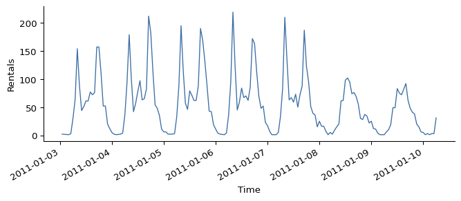
Figure 9.1 nicely illustrates patterns in the data: Most bike rentals are during the day. Workdays (Mon - Fri) show a bimodal distribution indicating rentals for morning and evening commute, and there is an overall higher usage. On weekends, we see a unimodal distribution centering around early afternoon.
Forecasting with TabICL
To forecast with TabICL, we use the class TabICLForecaster, a wrapper around TabICLRegressor. We predict the last week of data, and as context we pass the timestamps before that week. What I call “context” here would be the training data if we were using a traditional machine learning algorithm. For tabular foundation models like TabICL, no weights will be updated, but the model attends to the context data to predict.
Only the most recent 4096 rows are used
By default, only the most recent 4096 context rows are used. Increase max_context_length if you need more context to cover longer patterns and can bear the increased compute.
from tabicl import TabICLForecaster

horizon = 24 * 7 # one week of hourly data
context = series.iloc[:-horizon]
actual = series.iloc[-horizon:]

forecaster = TabICLForecaster(tabicl_config={"n_estimators": 4})
pred = forecaster.predict_df(context, future_df=actual[["timestamp"]])

preview = pred.head(3).round(0).droplevel("item_id")
preview.index = preview.index.strftime("%m-%d %H:%M")
print(preview.to_markdown())| timestamp | target | 0.1 | 0.2 | 0.3 | 0.4 | 0.5 | 0.6 | 0.7 | 0.8 | 0.9 |
|---|---|---|---|---|---|---|---|---|---|---|
| 12-24 23:00 | 18 | 10 | 12 | 13 | 15 | 15 | 17 | 18 | 21 | 27 |
| 12-25 00:00 | 17 | 7 | 9 | 10 | 12 | 13 | 15 | 17 | 21 | 31 |
| 12-25 01:00 | 11 | 6 | 7 | 8 | 9 | 9 | 10 | 11 | 13 | 18 |
The dataframe with the predictions may look a bit weird at first, so let’s take it apart. predict_df returns the predictions with a multi-index of item_id and timestamp. The item_id tracks different time series, and we only have one here, so I dropped that level for the printout above, and shortened the timestamps, to fit the table on the page. If we tracked casual and registered riders as separate series, they would get different item IDs – we will do exactly that at the end of this chapter. That leaves the timestamp, which tells us for which timestamp the prediction is. The columns contain the model predictions: target for the mean predictions, the rest are the respective quantile predictions, for example, column 0.5 contains the predicted 50% quantile, aka the median forecast. By the way: In the code example above we didn’t have to define the target. It’s because TabICLForecaster automatically uses the column we named target in the data.
Plotting prediction bands
The quantile predictions allow us to plot point-wise prediction bands in addition to the (median) forecast, which gives us a sense of uncertainty of the forecasts, see Figure 9.2.
forecast = pred.reset_index()

fig, ax = plt.subplots(figsize=(8, 4))
ax.fill_between(forecast["timestamp"], forecast[0.1], forecast[0.9],
                color="lightgrey", alpha=0.6,
                label="10th-90th percentile")
ax.plot(forecast["timestamp"], forecast[0.5], color="darkgrey", lw=1.5,
        label="median forecast")
ax.plot(actual["timestamp"], actual["target"], color="#c0392b",
        lw=1.5, linestyle="--", label="actual")
ax.set(xlabel="Time", ylabel="Rentals")
ax.legend(frameon=False)
fig.autofmt_xdate()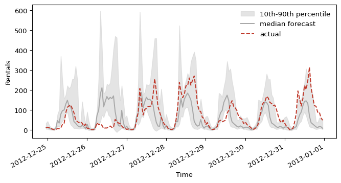
The model roughly predicts the correct shape around December 25th but with a little bit of a shift. Especially on December 26th, the model falls short as it overestimates the number of rentals. For the following days, the demand is underestimated, most notably around New Year’s Day.
Evaluating the forecast
Next we compare the mean absolute error of the TabICL forecaster with a simple naive baseline that reuses last week’s values.
A single week makes for a volatile evaluation
We only evaluate a single week here, which makes evaluation results volatile. A proper evaluation would backtest over a rolling window and average the results. We keep it to one week to stay focused.
naive_pred = context["target"].iloc[-horizon:].values
naive_mae = np.abs(naive_pred - actual["target"].values).mean()
Now let’s see how TabICL’s own forecast compares:
future = actual[["timestamp"]]
p = forecaster.predict_df(
    context, future_df=future, quantiles=[0.1, 0.5, 0.9]
).reset_index()
mae = (p[0.5] - actual["target"].values).abs().mean()
cov = ((actual["target"].values >= p[0.1]) &
       (actual["target"].values <= p[0.9])).mean()

print(pd.DataFrame([
    {"context": "Naive forecast (last week)",
     "MAE": round(naive_mae, 1), "80% coverage": "n/a"},
    {"context": "TabICLForecaster",
     "MAE": round(mae, 1), "80% coverage": f"{cov:.0%}"},
]).to_markdown())| context | MAE | 80% coverage | |
|---|---|---|---|
| 0 | Naive forecast (last week) | 98.1 | n/a |
| 1 | TabICLForecaster | 52.5 | 39% |
The TabICL forecast is a clear improvement over our simple baseline. The coverage falls well short of the nominal 80%, though, meaning the prediction band is too narrow here. However, we shouldn’t overinterpret these specific results, since we only evaluated one week of data.
Turning forecasting into a regression task
Let’s talk about how TabICL handles the task, despite not being pretrained to handle time series forecasting. TabICLForecaster is just a wrapper: It creates a table with temporal features from the timestamps, and gives it to TabICLRegressor for in-context learning. The secret sauce is therefore the features, which include:
- An index that starts at 0 and enumerates the time series.
- A raw
yearcomponent (not cyclic). - Sin/cosine pairs for: second-of-minute, minute-of-hour, hour-of-day, day-of-week, day-of-month, day-of-year, week-of-year, month-of-year.
- Dominant seasonal periods detected automatically through fast Fourier transformation, also added as a sin/cosine feature. Configurable via AutoPeriodicEncoder, which takes a PeriodicDetectionConfig. Knobs: detrending method (
first_diff,loess,linear,constant), Hann windowing, zero-padding factor,max_top_kperiods, magnitude threshold, optional ACF cross-validation.
Figure 9.3 visualizes some of these features over time.
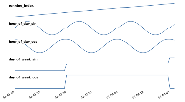
TabICLForecaster-generated features over three days: the running index (trend) and the sin/cosine encodings of hour-of-day and day-of-week.
You can control the set of features that are included with the parameter temporal_features. For example, temporal_features = ['index'] only would include the sequential feature. The default is ["index", "datetime", "periodic"]. The only option that is not included by default is "fourier" for Fourier basis features that help with periodicity.
Playing with the context window
With the context window, we control the data to which the model may attend for forecasting. For the bike sharing example, we relied on the model’s default cap of 4096 timestamps. Thanks to the forecasting-as-regression and the in-context learning, we could just as easily pass less context, more context (compute permitting), or a completely different window.
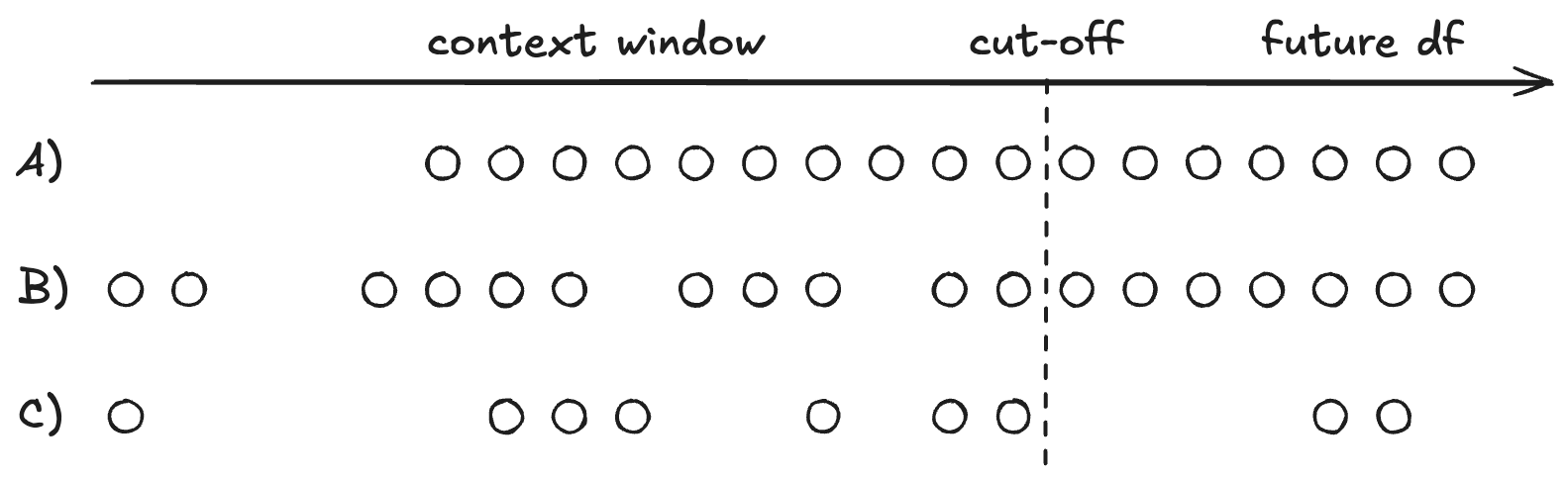
TabICLForecaster can handle gaps in the time series, and the timestamps don’t have to be equidistant. This freedom comes from turning time into features, instead of an autoregressive structure.
This flexibility means that context engineering replaces re-training. Because training data became context data, things that used to require a full retrain are now row edits: drop a user who asked for data deletion, slide the window to the last 30 days when the data drifts, build the context from a single region or segment, throw out poisoned records, or append corrections as they come in. All of it is possible with traditional machine learning, but with a different cost profile. Context engineering just can also be a necessity as context length is still a limiting factor for TFMs.
You have the same flexibility for the prediction, as you can control the timestamps for which you want the predictions, which can be an irregular grid, and it can have gaps, as visualized in Figure 9.4.
prediction_length instead of future_df
Instead of defining the timestamps for the prediction, you can also provide a prediction_length number, which tells the model how many time steps to roll the prediction forward. However, this only works when all stars are aligned: The model must be able to infer the frequency from the context data, which means context timestamps must be equidistant, and have no missing values. In addition, you can’t use features besides the automatic timestamp-derived features.
Including other features
Alright, time to include external features beyond just the timestamp and its derived features. We will add the holiday feature, a binary indicator telling the model whether the current timestamp is on a holiday.
series_cov = df[["timestamp", "cnt", "holiday"]].rename(
    columns={"cnt": "target"}
)

context_cov = series_cov.iloc[:-horizon]
future_cov = series_cov.iloc[-horizon:][["timestamp", "holiday"]]

pred_cov = forecaster.predict_df(
    context_cov, future_df=future_cov, quantiles=[0.1, 0.5, 0.9]
).reset_index()
Let’s check whether the covariate actually improved the forecast:
mae_cov = (pred_cov[0.5] - actual["target"].values).abs().mean()
print(f"MAE with holiday covariate: {mae_cov:.2f}")
MAE with holiday covariate: 51.83The covariate seems to help a little bit, but again, just one week of evaluation, so let’s not read too much into it right now. And we can plot the forecasted week again, see Figure 9.5.
fig, ax = plt.subplots(figsize=(8, 4))
ax.fill_between(pred_cov["timestamp"], pred_cov[0.1], pred_cov[0.9],
                color="lightgrey", alpha=0.6,
                label="10th-90th percentile")
ax.plot(pred_cov["timestamp"], pred_cov[0.5], color="darkgrey", lw=1.5,
        label="median forecast")
ax.plot(actual["timestamp"], actual["target"], color="#c0392b",
        lw=1.5, linestyle="--", label="actual")
ax.plot(forecast["timestamp"], forecast[0.5], color="lightblue",
        lw=1.5, linestyle=":", label="median forecast (no holidays)")
ax.set(xlabel="Time", ylabel="Rentals")
ax.legend(frameon=False)
fig.autofmt_xdate()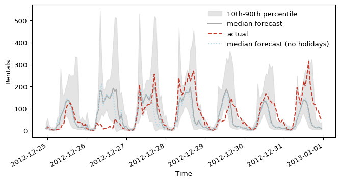
The covariate reins the forecast in around December 25th, closer to the actual, lower demand. The 26th (not an official holiday in this dataset) still comes in noticeably below the actual spike.
Forecasting multiple series
So far, we only forecast a single time series. But often we have multiple time series, be it through different targets (e.g., forecasting CO2 and NOX) or multiple sites (e.g., multiple stores). In our example, our target, the number of rented bikes, is actually the sum of two types of cyclists: casual and registered. We can forecast both at once, treating each rider type as a separate series via its own item_id.
long = df.melt(id_vars="timestamp", value_vars=["casual", "registered"],
               var_name="item_id", value_name="target")

cutoff = long["timestamp"].max() - pd.Timedelta(hours=horizon)
context_multi = long[long["timestamp"] <= cutoff]
actual_multi = long[long["timestamp"] > cutoff]

pred_multi = forecaster.predict_df(
    context_multi,
    future_df=actual_multi[["item_id", "timestamp"]],
    quantiles=[0.1, 0.5, 0.9],
)
head = pred_multi.groupby("item_id").head(3).astype(float).round(1).reset_index()
head["timestamp"] = head["timestamp"].dt.strftime("%m-%d %H:%M")
print(head.to_markdown())| item_id | timestamp | target | 0.1 | 0.5 | 0.9 | |
|---|---|---|---|---|---|---|
| 0 | casual | 12-25 00:00 | 1.3 | -0.4 | 0.6 | 3.8 |
| 1 | casual | 12-25 01:00 | 0.9 | -0.6 | 0.2 | 3 |
| 2 | casual | 12-25 02:00 | 0.4 | -0.7 | -0.2 | 2.1 |
| 3 | registered | 12-25 00:00 | 11.7 | 4.8 | 10.1 | 19.1 |
| 4 | registered | 12-25 01:00 | 10.4 | 5.6 | 9 | 15.5 |
| 5 | registered | 12-25 02:00 | 8 | 4.2 | 6.9 | 11.9 |
Forecasting multiple time series at once, in this way, is basically just a convenience wrapper. A bit simpler code, and each item_id is dispatched in parallel across up to 8 worker processes via joblib, which happens automatically based on hardware. Beyond that, each series is forecasted individually, so no accounting for correlations between the series.